|

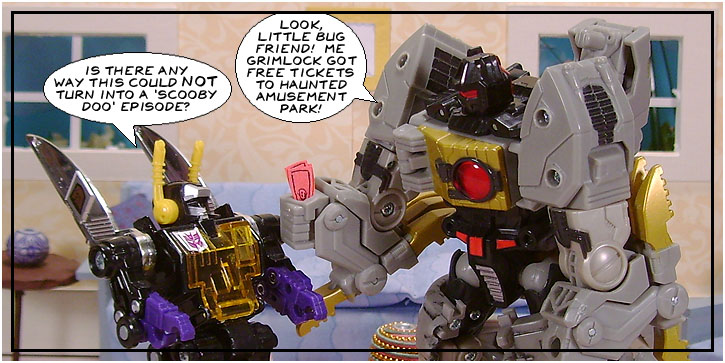
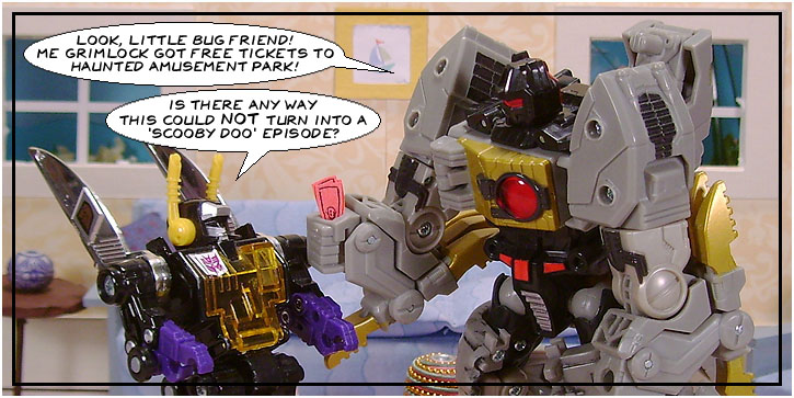
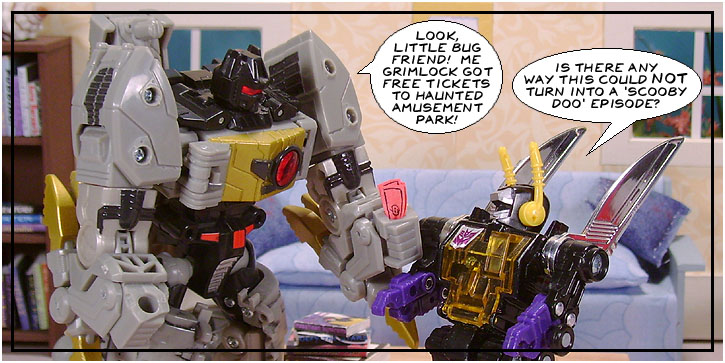
So Grimlock's word bubble is higher. Obviously, the reader will read it first.
Wrong.
If you learned to read in English, you're going to read from left to right, and my word bubble is far enough left that the reader will probably try to read it first, though it's below Grimlock's. Some comic artists don't even make it this obvious, with the bubble to be read first only slightly higher than the one to be read second.
Or maybe I'm pretending it's manga because I'm a pretentious jerk.
Taking five minutes to figure out the layout instead of just barrelling ahead without planning could have saved me a lot of trouble here.

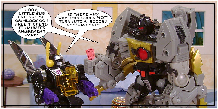
There! That fixed it, right?
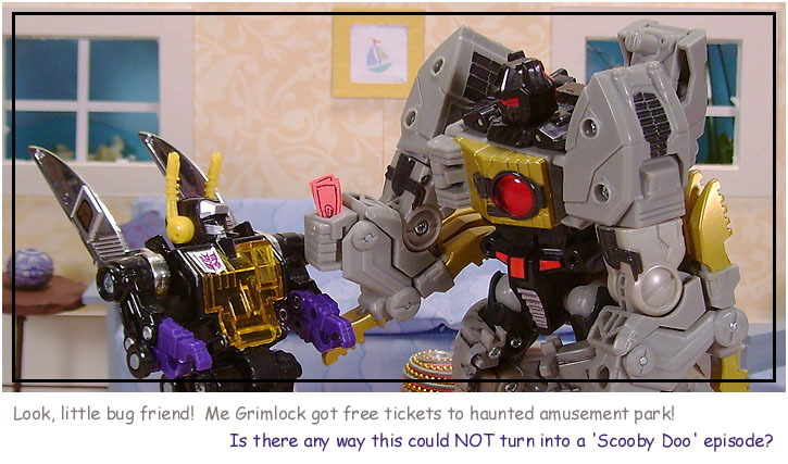
Bleagh. You need a reason better than "I didn't plan my layout and should have had the figures switched" to cross the tails of your word bubbles.

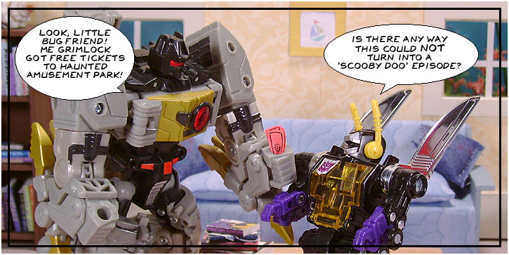
It's still ugly. English-speakers don't just read text left to right, they read pictures like that, too. Here, the reader is forced to read the panel unnaturally - first Grimlock's dialogue on the left, then skipping all the way right to look at Grimlock, then reading right to left to read my bubble and look at me.
If I was totally married to this layout with Grimlock on the right, it would work if he was the only one who got to speak, with my reply in the next panel.

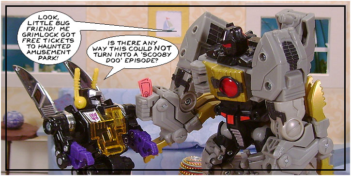
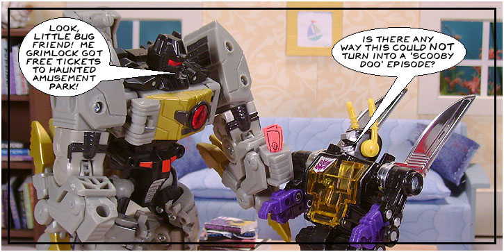
This is just a mess. There's all this dead space over my head and I go slap a word bubble over one of the figures instead.

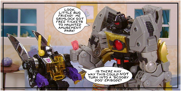
This is about as good as you're going to get with this layout. At least the dialogue is in the right order, even if the picture isn't.
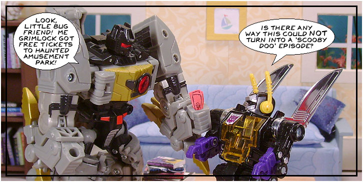
The dialogue could be stretched to two long lines instead of three shorter ones, but with elliptical bubbles odd numbers of rows fit better. The same text in two rows would make a fatter bubble with more dead space than one with three shorter rows.

Now here's what happens if you don't fiddle with your text to make it fit a bubble: You end up with a lot of wasted white space covering up the art. Plus, it looks ugly and sloppy. It only takes a couple minutes to rearrange your text into a more pleasing shape.

I know the words are coming out of our mouths ( or masks, in Big Grim's case. ) We don't have to chew our word bubbles.

This isn't bad, but it isn't ideal - you're supposed to keep the word bubbles off the figures, even if Grimlock's arm isn't important. That's fine for drawn comics, but photocomics are trickier. The figures can't bend every way you want and if you shrink it down too far, the art becomes illegible. Keeping the faces uncovered is sometimes the best you can do.

This one is the best use of the dead space and it doesn't impede the eye contact between me and Grimlock - we're having a conversation, not reading each other's word bubbles.

Don't even talk to me. Captions = fine. Untagged dialogue = bleagh. Here there's only two characters, the action is clear, and one of them says his own name. Get several characters doing something vague and it just becomes a mess.
|


